From then, to now…
Our very own Mrs Munchy takes a look back over the last 20 years, and how the Munchy Seeds brand has grown.
20 years ago this year, my husband Crispin and I started roasting and selling Munchy Seeds at county shows and exhibitions around the country. Inspired by my New Zealand grandmother’s delicious savoury toasted two seed recipe that we kids had grown up on, either as a snack or sprinkled over our salads. Back then our tubs carried the original design of a smiling sunflower which had been created by my parents 10 years earlier.

Original New Zealand Munchy Seeds Branding
In 2007 we launched our Munchy Seeds into Waitrose, but our smiley sunflower looked so dated against other products around us. So we decided it was time to properly invest in our brand and come up with a more current looking design. We wanted something people could recognise instantly on shelf; was fun and of course engaging (a reflection on both ourselves and our Team). We ended up using top food design agency, Ziggurat and were utterly thrilled with our new modern look. “Mindful munching” was our newly adopted strap-line and we carried this new look for the better part of 12 years (which in the design agency world, is considered to be a rather long time)! So a properly good testament to Ziggurats fun design.

New Branding by Ziggurat featuring our animal hands!
By 2018, trends in the snacking world had drastically changed around us and despite having the most perfect of natural snacks (toasted & lightly flavoured, no artificial ‘anything’s’, perfect for vegetarians/vegans, full of fibre and not processed) we were falling behind other brands. It was time to ‘lift our game’ and get Munchy Seeds noticed again!
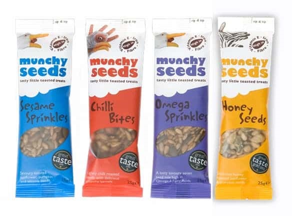
Animal Hand Snack Packs
Finding the correct design agency is key to achieving 100% the look and feel you are after, we were fortunate enough to come across B&B Studios having seen some other fantastic examples of their work. Their signature is always bright, fun and the messaging is directly to the point. We recognised everyone understands ‘seeds are good for you’, instead we needed a look that screamed “EAT ME!”!
My most favourite part of the rebranding exercise was when we finally sat around the conference table in B&B Studios ready for the big ‘reveal’. It had been 11 months of strategy and planning, at last finally coming down to the exciting ‘pictures’ bit. The minute we saw our new logo we got goose bumps – this was ‘IT’ the new brand to carry us into our next decade… BOOM… just like that B&B had done it… a fresh, fun & straight to the point logo for our fabulous little product – something my parents and the exceptional Munchy Seeds crew work so hard to produce fresh for our customers daily.

The NEW Bright and Impactful Munchy Seeds
Also in a bid to move away from using so much plastic in our packaging, after 20 years we’re changing across to resealable pouches and foil film snack packs, sadly these are not recyclable ‘yet’ but as we are only at the beginning of this part of our journey and feel by making these two changes its a whopping 60% plastic reduction to start with so it’s a really positive start for now.

Swapping Tubs out for Pouches saved a whopping 60 percent in plastic!
We certainly hope you get as much of a ‘kick’ out of seeing our new packaging and look on shelf as we do, and that you will continue to spread the word and keep eating Munchy Seeds to fuel your next adventure wherever life may take you… Happy Munching all!
Cheers
&

Free Postage On Orders Over £30
Get shopping